I’ve previously talked about detecting irrigated croplands in this blog. I used classical machine learning techniques in it, i.e. we decide what features to use, we fit a model or an ensemble of models, we predict. Modern machine learning, or what the press calls “Artificial Intelligence”, has gone way beyond it.
In this post, I want to talk about a different approach to detect irrigated croplands. This method gave 95% test-set accuracy on a random sample of 2000 pictures from California.
SAR Data
In the experiment I’ll describe, I did not use the usual satellite images that produce data in the visual spectrum. Instead, I used images coming from a satellite that uses radio waves. This is known as SAR (short for Synthetic-Aperture Radar). SAR has two primary benefits with respect to machine learning:
- SAR works day or night
- SAR works even on cloudy areas
This means we get a reliable, continuous data stream, especially during the rainy season, which matters a lot in agricultural problems. Behind the scenes, a SAR satellite continuously sends radar waves and collects the waves reflected back. You can imagine the waves getting reflected differently based on whether the satellite is passing over hills, lake, buildings, forest, desert, or grasslands. Curiously, the camera is side-looking in a SAR satellite, so the picture can look different based on the direction the satellite is orbiting.
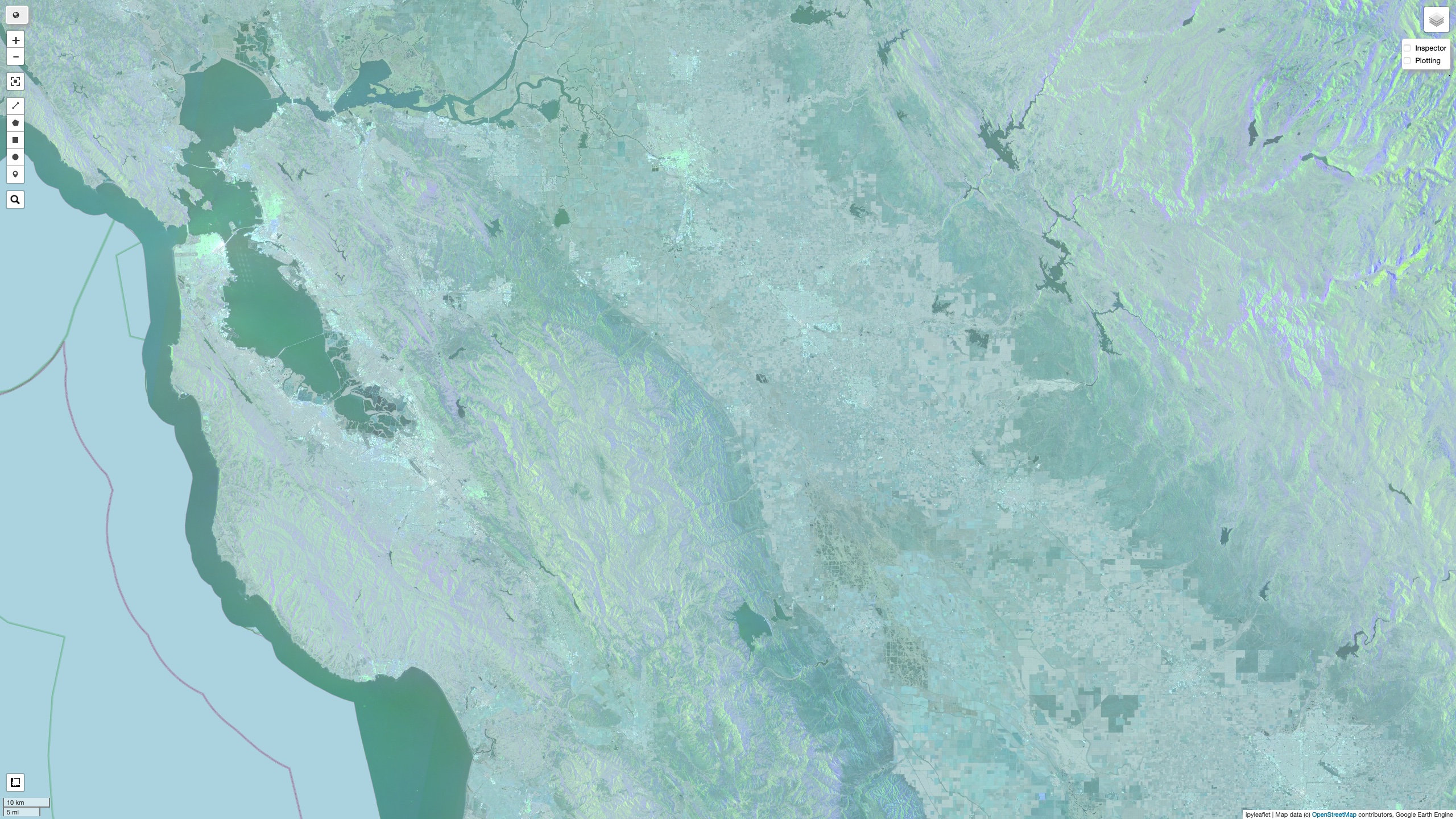
Sentinel-1 is a relatively new satellite that takes SAR pictures on a global scale. The dataset is available on Google Earth Engine for 2 bands:
- VV
- VH
The letters represent polarizations at sending and receiving time. Sentinel-1 has a pair of satellites revolving around the Earth in opposing directions.
Transfer Learning
In my experiment, I wanted to use SAR data as pictures for a pre-trained image classification network. These are neural nets already trained on massive image datasets on Google-scale hardware. I used VGG-16 for my experiment, but other architectures are possible. Typically, these networks are many layers deep. VGG-16 is 16 layers deep; such deep neural networks are the reason this sub-field is called “deep learning”. After training, researchers can sometimes make the model available for free for further research.
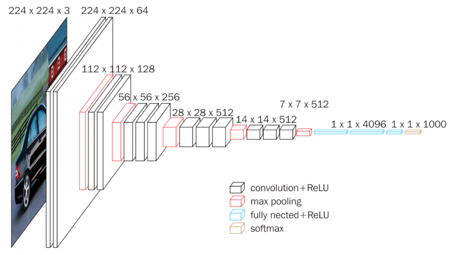
We can think of VGG-16 as a mini eye and brain: it takes in a bunch of pictures, and at the end, tells me whether it’s a cat, a dog or 998 other possible classes. Inside this eye-brain box is a pipe, or a deep neural network, and only the last layer does the final classification.
We can throw that layer away, and use the rest of the model as-is, to see if we can get it to “see” croplands and non-croplands.
In other words, we will give a bunch of labelled SAR pictures to VGG16, and ask it to tell us: do you see a cropland or not?
This is known as transfer learning, because we are transferring whatever is in the brain of VGG-16 to our problem of detecting croplands.
VGG-16 looks at JPEG pictures, and any color JPEG you see on the computer has 3 channels: red, green, and blue. How do I fit SAR dataset into this model? I explored both VV and VH bands in ascending and descending orbit of the satellite separately. VH data didn’t change much. VV data looked somewhat different, especially on the hills. That gave me an idea on the 3 bands I could use:
- VH
- VV in ascending orbit
- VV in descending orbit
I also needed someone to tell me whether it’s a cropland or not. I could, of course, just look at the pictures and decide, since it’s fairly obvious, but I used a professional dataset for this purpose. It’s called LANID, and it classifies all of United States into irrigated croplands and otherwise. I used LANID labels for the year 2017.
So far, we have labels, we have features. We are ready to take some pictures and do some transfer learning.
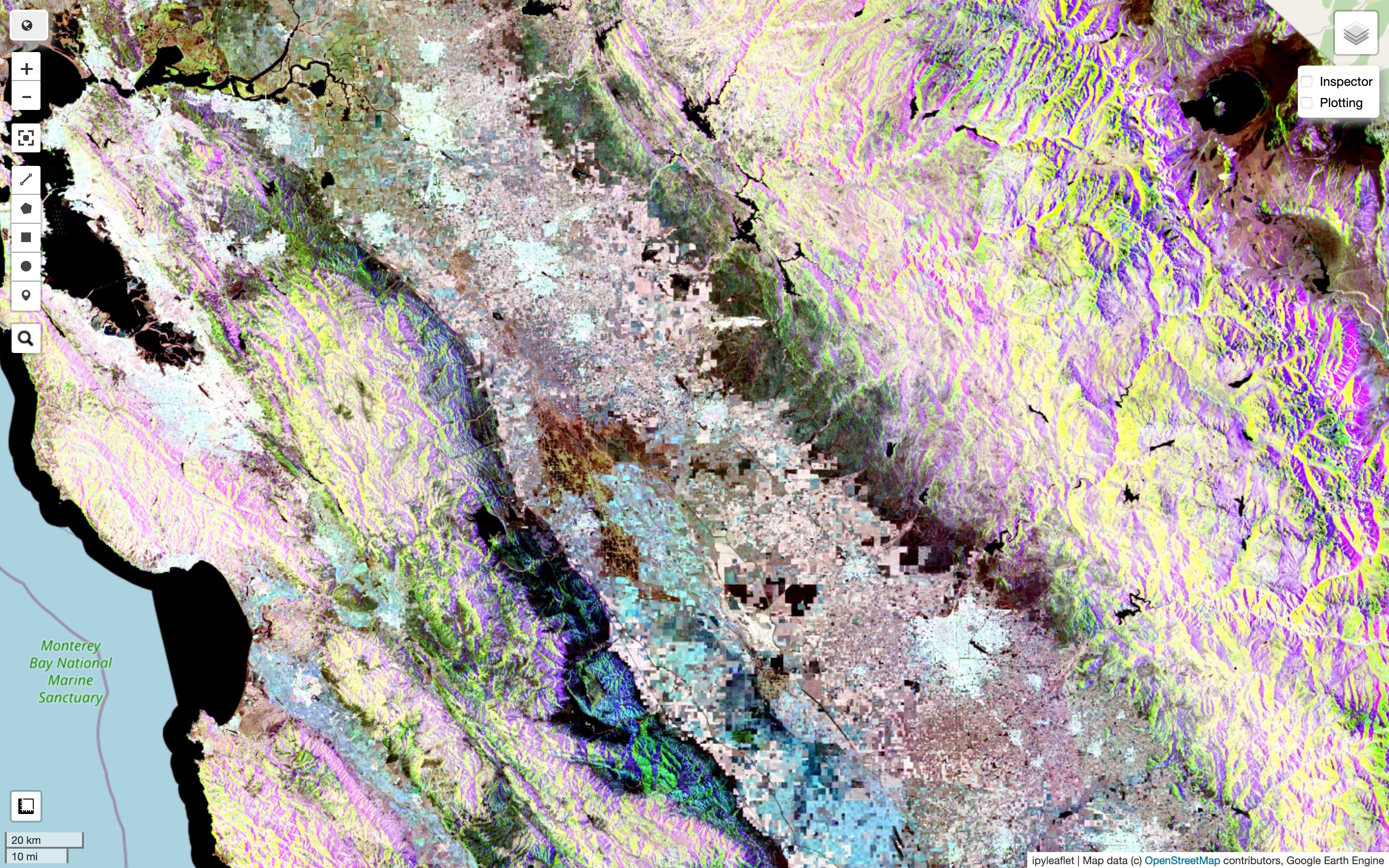
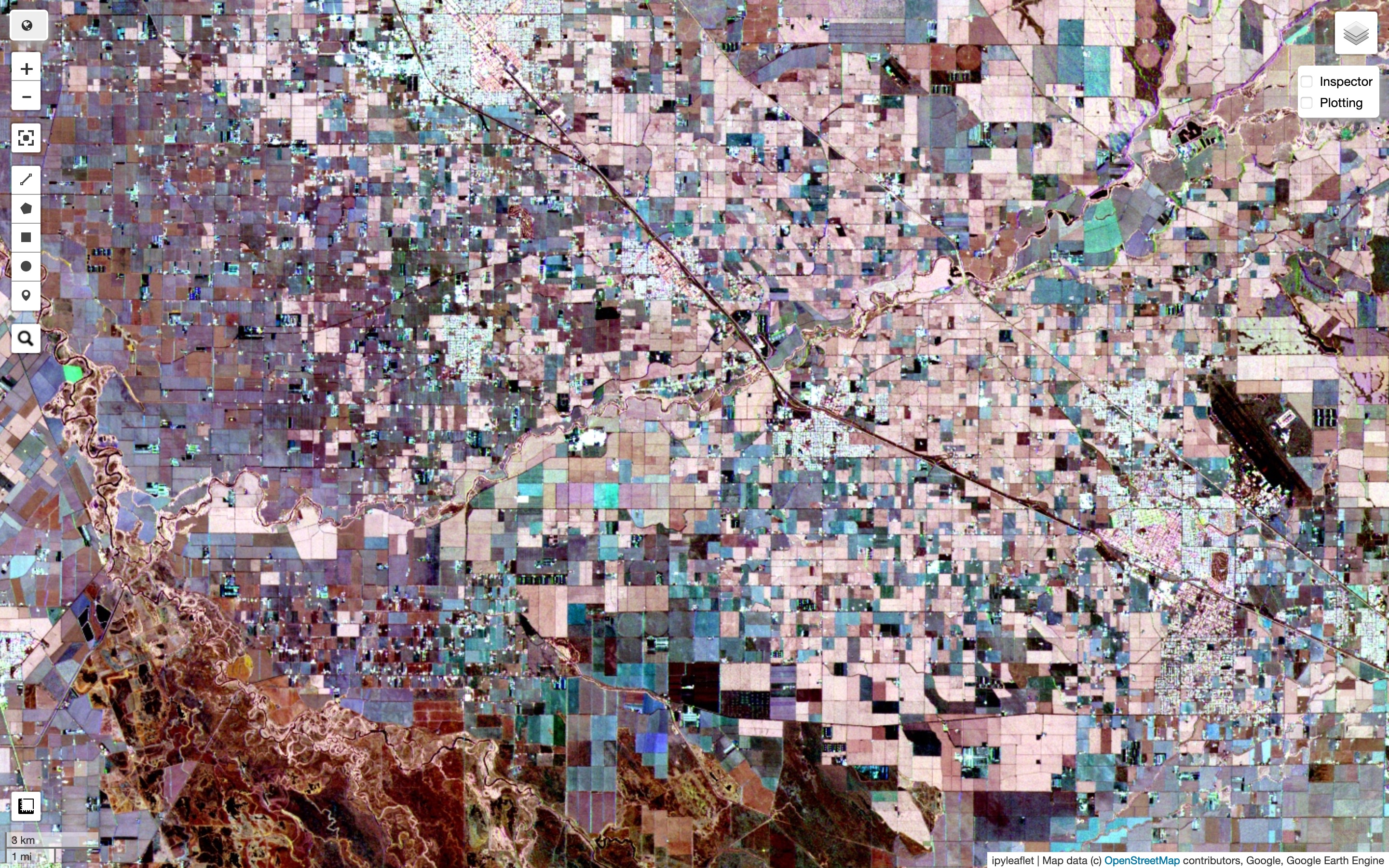
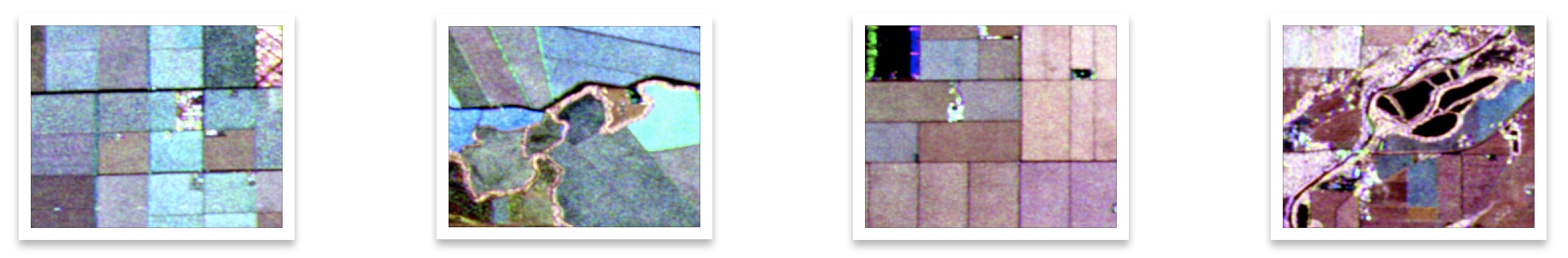
I took a random sample of 2000 different points (latitude-longitude pairs) all over California. I averaged SAR data values from throughout the year 2019, which I found was a good year for Sentinel-1 data (and 2017 was the latest year for which LANID was available). I took care to keep the dataset balanced, by taking samples for irrigated and non-irrigated regions separately. If you don’t do this, you will get only about 15% of the samples as irrigated. I decided on a buffer of 1km around the point. Here’s how it actually looked.
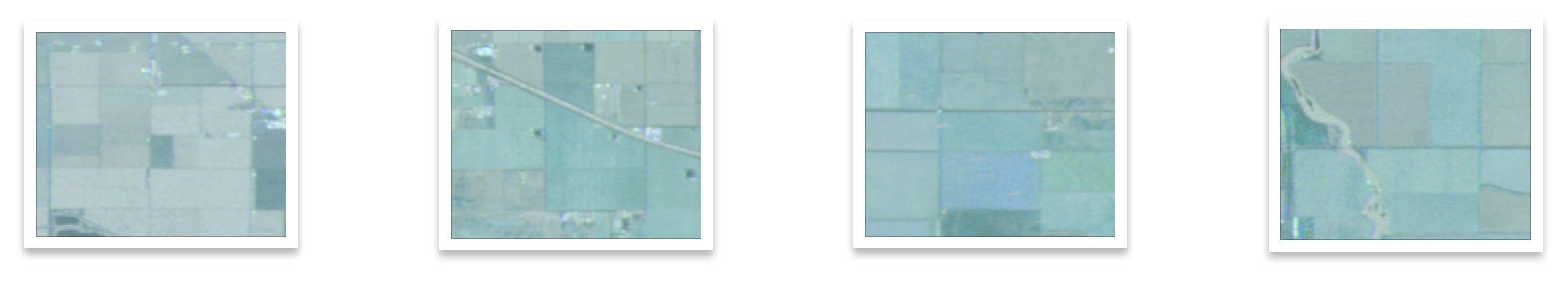
Do you think “they all look green to me”? Hold on to it, we’ll come back to it later.
Take One, Results
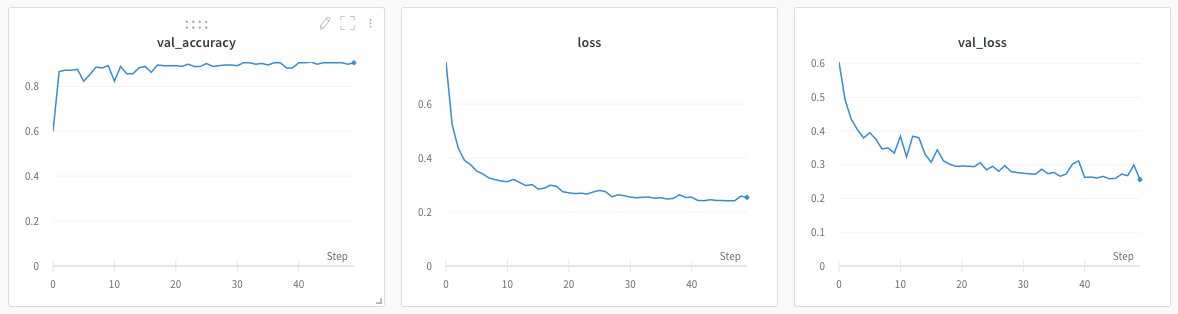
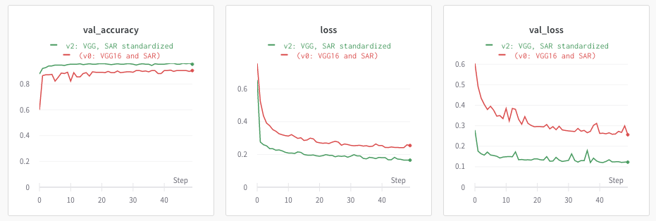
So I split the pictures randomly into 70% training, 15% validation, 15% held-out test set. I trained the model and got 91% validation accuracy (90% held-out test):
This seems high enough, but I felt that the VGG-16 eye was seeing the same greenness that my eyes were seeing. Surely we can do something about it?
Take Two, Results
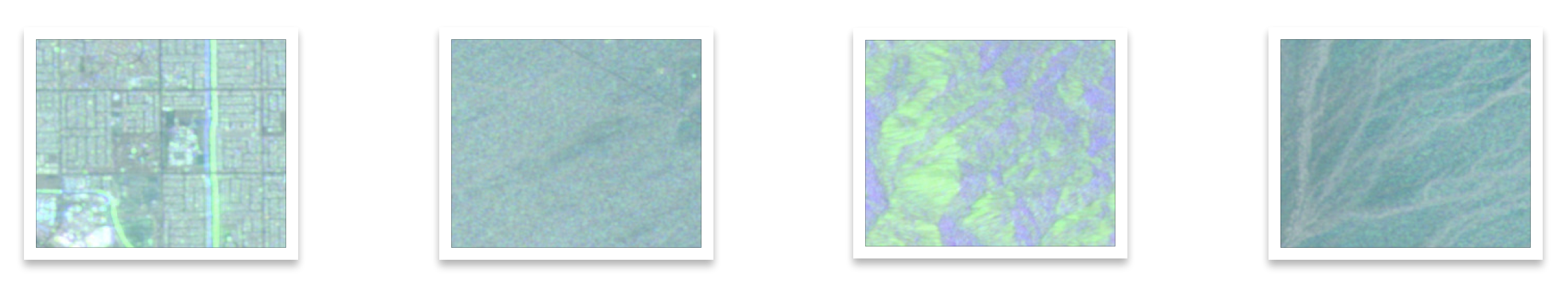
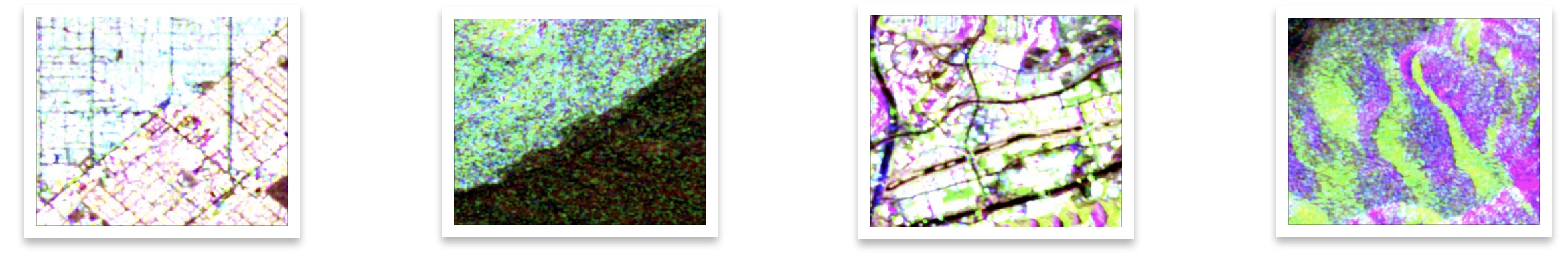
I went back into my SAR data exploration notebook. SAR data ranges from -50 to 1. RGB values range from 0 to 255. But does California SAR data actually range from -50 to 1? No, I could see the minimum and maximum values. I could also see their distribution via mean and standard deviations. So I standardized my SAR data, based on what I saw as mean and standard deviation. The variability is higher in the non-irrigated class, because it could be a forest, city, hill, or a desert. I standardized based on this class. Standardization fits data into a neat Gaussian curve and really made a difference. Check out the new pictures:
Zooming in some more:
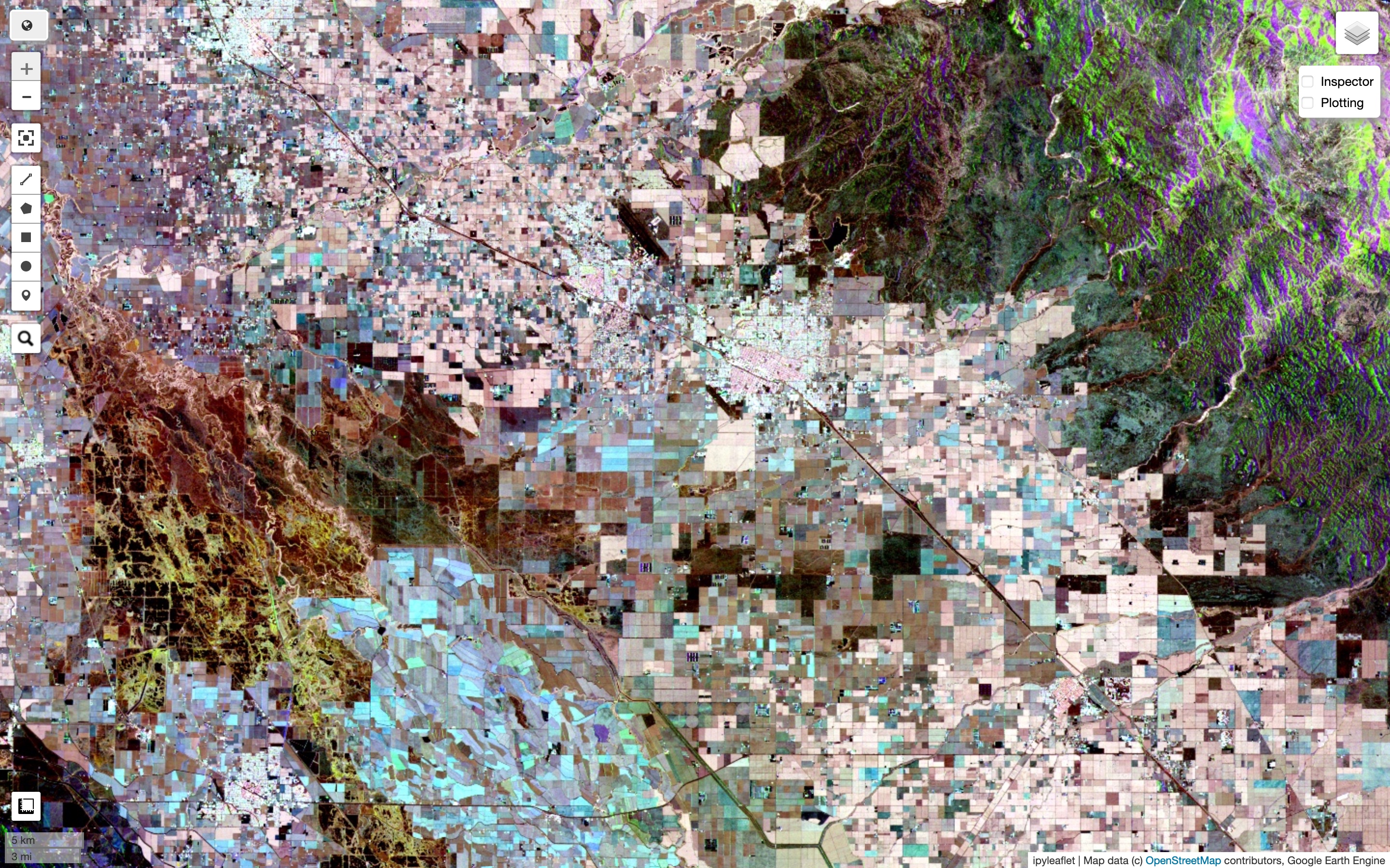
Zooming in even more into Central Valley, here are two pictures of the same region, first for SAR and second in visual spectrum. Note that areas that simply look green can have different colors in SAR, indicating they are probably different crops and they scatter radio waves differently.
We can now look at some of our new samples for training:
When I trained the same model again on this new dataset, the validation accuracy jumped to 95.4% (same with test set). This is without any hyperparameter tuning, on a plain-vanilla VGG-16 network. That’s a huge deal. You can see the jump in the graphs below (green lines represent run on standardized SAR dataset).
We can probably improve it further by using a different neural net and/or tuning parameters. But there’s diminishing returns, and there’s always some residual noise in the data. After this, I tried two things: I looked at the pictures and corrected for some misclassifications in the training dataset. I also tried fine-tuning on the last two layers. Neither of these really made a difference on validation accuracy. I stopped at this point.
Conclusion
There are two points I’d like to conclude with. First is something relatively obvious: SAR satellite data and cognitive-domain machine learning (or “AI”) hold a lot of promise for research into agriculture, water sustainability and climate change.
A second point is that in machine learning, it’s important that you understand the picture end-to-end. In this experiment, I collected the data myself, I looked at it, I reasoned about how to make it look better, I made a choice on how to massage it so that it can be fed into neural nets, and continued to improve it afterwards. There are a lot of moving parts. It is extremely important that we continuously look at the big picture and be able to control every step of the way for maximum impact. If I’d stuck to green SAR pictures because someone handed it to me, I would have never made it 95%. If I’d not done data exploration myself, I wouldn’t know how to create the right bands for my SAR pictures. These benefits add up non-linearly.
Credits
This is an independent experiment inspired by my collaboration with Michelle Sun. The head of our research group, Alberto Todeschini, provided useful feedback on the experiment. Yanhua Xie kindly provided me access to the LANID dataset for our research. Thank you all.
Source Code
Results are reproducible. Run hyperparameters and results are saved and available on WandB.ai.
- Notebook for initial SAR transfer-learning for irrigation detection (90% test accuracy)
- Notebook for standardized SAR transfer-learning for irrigation detection (95% test accuracy)