Back in 2006, I wrote a script (in Perl!) to plot daylight hours over the year, given a location. From what I remember, I was curious about how it changed with the seasons: was it a straight line or a curve, and how did it look in the polar regions?
(If any image below looks blurry, open it in a separate tab or save it to disk to see it in actual size.)
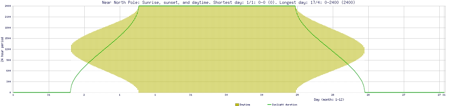
Near North Pole (79°N). They see no Sun for half the year, and then it’s day non-stop. Note the curve of spread:
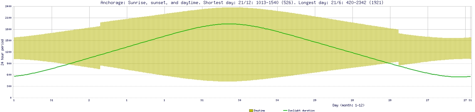
Anchorage, Alaska. Spikes in these graphs are due to daylight saving time turning on and off:
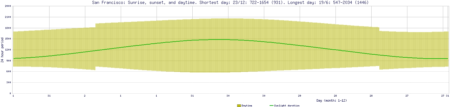
San Francisco, California:
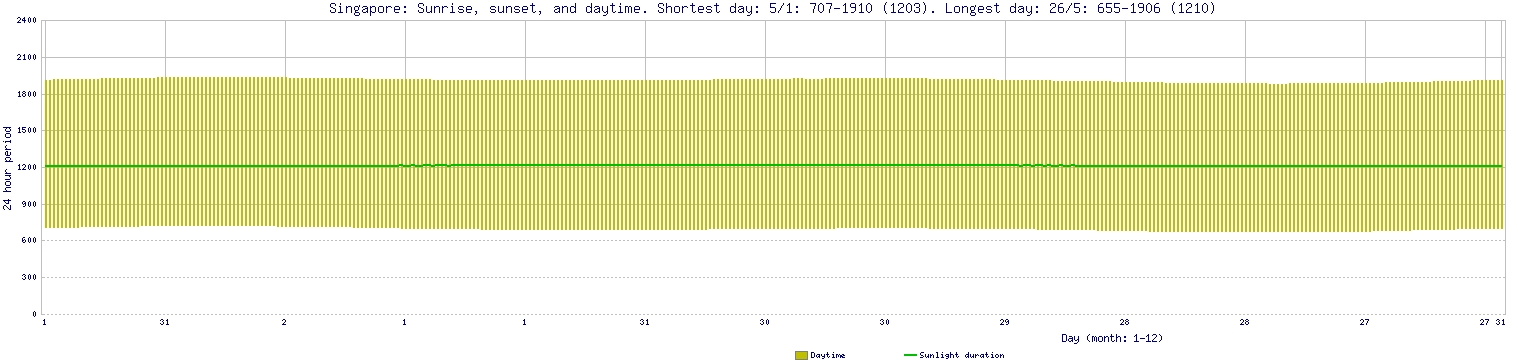
Singapore. It’s just 1° off the equator, and it shows:
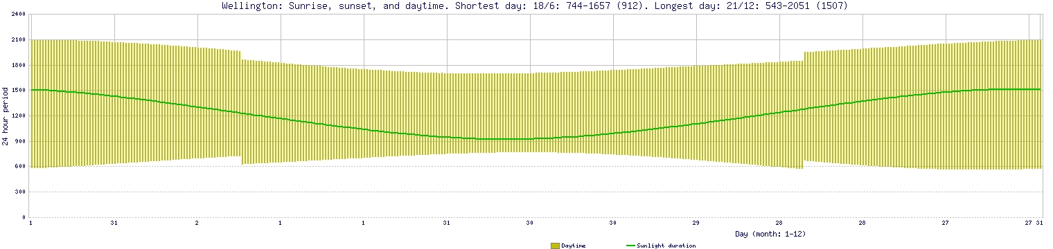
Wellington, New Zealand. The graph is concave in Southern Hemisphere, where the seasons are reversed:
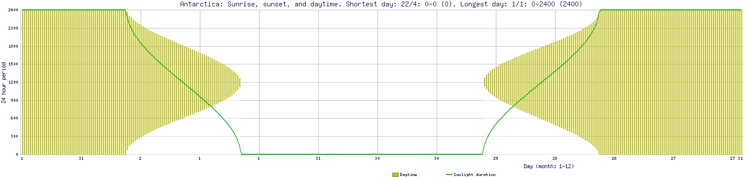
Antarctica, 79°S. Note how this is a complement of what we saw for the Arctic:
Script
These graphs were created from data in sunrisesunset.com. I wrote a script to parse off the values from those webpages and plot the graph using GD library. You can download the script. (Made available with permission from owner of that website.)